Developing A Communication System To Elevate Engagment
Aimlab is an aim-training game used by casual and pro players to sharpen their FPS skills. Players loved competing on leaderboards, but had to leave the game to share scores and connect with each other on Discord, Twitter, or Reddit.
As Product Designer, I led the design of an in-game communication and friend system so players could challenge, compare, and learn from each other without ever leaving Aimlab.
Impact
100K+ one-on-one interactions in the first month of launch
+40% increase in DAU/MAU and +50% lift in user engagement across the product
Laid the foundation for future social + multiplayer features inside Aimlab
Methods
Player survey and persona development
Competitor analysis of Discord, Twitch, and Steam designedbynatalie.framer.ai
User flows and interaction design for friend, challenge, and viewing flows
High-fidelity UI design and prototyping in Figma
The Challenge
Players were already treating Aimlab like a competitive arena, but the product behaved like a single-player tool. To share a big score or connect with someone from the leaderboard, they had to screenshot, alt-tab out, and post on third-party platforms.
The team wanted to keep that social energy inside the game: give players a way to add friends, issue challenges, and compare gameplay—all without turning Aimlab into a noisy chat client.
Understanding Player Needs
I started with a survey and qualitative research to understand how different types of players (aspiring pros, grinders, and casuals) actually used Aimlab and why they wanted to socialize.
Three themes stood out:
Motivation through visibility Players wanted their scores to be seen. Public performance created accountability and motivation to keep improving.
Learning from others – Watching how higher-ranked players approached tasks was one of the fastest ways to improve.
Community and recognition – Regular names on the leaderboard started to feel familiar; players wanted a way to turn “I recognize that username” into an actual connection.
This made it clear the feature wasn't just about chat, it was about structured, performance-driven interaction.
How do we streamline a way for users to engage with community so that they can successfully learn, communicate and excel at gaming within Aimlab?
Decoding the Competition
To avoid reinventing the wheel, I studied how other platforms handled game-adjacent social systems: Discord, Twitch, and Steam.
Key patterns I pulled in:
Persistent friend presence Steam’s always-available friend list during gameplay set a strong pattern for how social UI can sit around the core experience.
Rich player context
Twitch’s channel pages and VOD history showed how valuable it is to see someone’s broader activity at a glance.
Organized spaces for interaction Discord’s use of channels and roles highlighted the importance of structure over chaos in social spaces.
The goal wasn't to copy these platforms, but to borrow what made sense for Aimlab's more focused use case, quick 1v1 challenges and performance comparison.
Framing the Requirements
From research and product constraints, we aligned on what the MVP needed to support:
A friends list feature would allow players to form connections with others they frequently encounter on leaderboards, addressing the lack of social interaction and community building in competitive gameplay.
The ability to view a friend's status and scores, solving the problem of limited motivation and accountability by fostering friendly competition and encouraging players to improve their performance.
The ability to view your friend's game history feature that enables players to review past interactions and gameplay, addressing the need for skill development by allowing users to learn from others' successes and mistakes.
More advanced moderation features (blocking, reporting, harassment flows) were documented for future iterations once the core system proved its value.
From Ideas to Flows
I sketched multiple concepts for how a social layer could fit into the existing Aimlab UI: overlays, side panels, and full-screen hubs.
We landed on a social dropdown + mini profile pattern that hit the right balance:
Easy to access from the global nav
Small enough to not interrupt training
Flexible enough to grow into more social features later

Sketches from team brainstorming sessions
User Journey
From there, I mapped user flows for:
Sending and accepting friend requests
Viewing a friend’s recent tasks and stats
Watching a friend’s last replay for learning and comparison

Solution
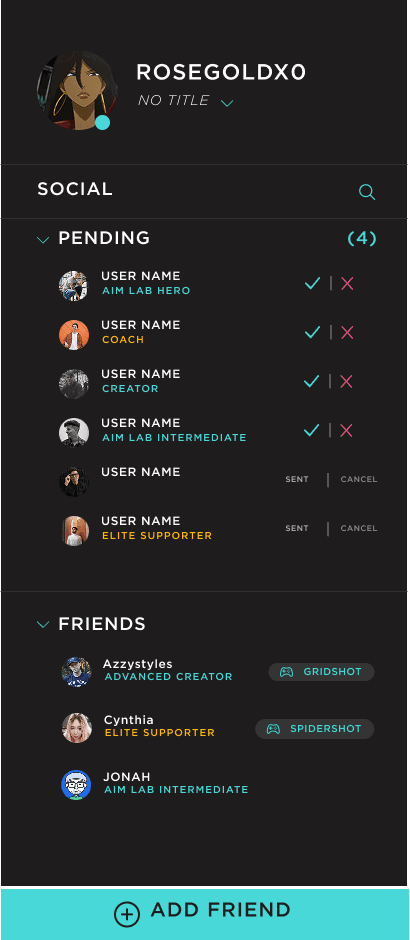
The final design introduced a dedicated Social entry in the main navigation that opens a friends panel right inside the core Aimlab UI.
Friends List Dropdown
Quick access to online and offline friends
Clear states for pending, sent, and accepted requests
Search and add-friend flows that feel native to Aimlab’s visual language
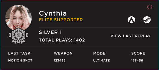
Mini Profile Overlay
Snapshot of a friend’s rank, total plays, and recent task
Key stats like score, mode, and weapon for their last run
Direct link to their Steam profile and a button to view last replay, so players can study and compare gameplay side-by-side
The UI followed the new design system Aimlab was rolling out at the time, ensuring components, color, and typography stayed aligned with the rest of the product.
Impact and Reflection
In its first month, the Friend System facilitated over 100K one-on-one interactions and became the backbone for future social and multiplayer ideas inside Aimlab. Engagement metrics across the product climbed, with more players returning to train and compete because their progress now lived in a social context, not just a solo grind.
On the craft side, this project pushed me to be more intentional with color and hierarchy. Early versions used high-contrast colors that vibrated and hurt accessibility; feedback from design leads helped me recalibrate how we applied the new design tokens so primary actions, status states, and social alerts were readable for everyone.
Overall, the work reinforced two things for me:
Social features are most powerful when they amplify the core loop (in this case, training and competing), not distract from it.
A good system doesn’t just look on-brand—it scales. The Friend System was designed as a foundation the team could keep building on, not a one-off feature bolted to the side of the game.
"Natalie as an exceptional designer who consistently prioritizes user needs with remarkable dedication. Her work exudes empathy, resulting in impactful designs."
Joe Siconolfi
Ex Head of Design at Statespace Labs