Designing Aimlab VR:
Navigating Ambiguity and Crafting Immersive Experiences in Unity

Stepping Into VR With No Playbook
Early in my career, I was asked to redesign Aimlab for virtual reality using Unity—at a time when I had zero VR experience and no established blueprint to follow. The brief was basically: “Make this feel like Aimlab, but fully immersive.” There wasn’t a clear roadmap, so my first job was to define what “good” looked like in this new medium.
Framing the Problem Like a Product Owner
I treated the work less like a UI practice and more like a product definition exercise. I dug into VR principles—comfort, depth, readable distances, motion sickness triggers—and mapped those constraints onto Aimlab’s core loop: select a task, train, review performance, repeat. From that, I framed key product questions: What does a “quick training session” feel like in VR? How do we keep players focused on performance, not just novelty? Where can spatial UI actually improve clarity instead of just decorating the environment?
Designing, Testing, and Iterating in VR
With that framing, I explored multiple interaction models: floating 2D panels, curved HUDs, and spatial layouts where menus and feedback wrapped around the player. I ran lightweight usability tests—having people stand in mocked-up environments and talk through what felt intuitive versus overwhelming. Each round of feedback drove specific changes: reducing peripheral noise, simplifying hand/controller actions, and clarifying where players should focus at any moment.
I worked closely with developers in Unity, adjusting designs when something that looked great in Figma felt wrong at VR scale or caused discomfort in the headset. I wasn’t just handing off screens—I owned the loop from concept through implementation, making tradeoffs in real time with the team.


Mixed Feedback, Clear Direction
The first release got mixed feedback: many players loved the immersion and “wow” factor, while others surfaced issues around onboarding, clarity, and long-session comfort. I treated that not as failure, but as direction. The response highlighted exactly where the experience was delivering (immersion, interactivity, fun) and where it needed another iteration.
This project didn’t just teach me VR design—it taught me how to navigate ambiguity and own a product in a new space. I learned how to define success when the medium is unfamiliar, turn vague goals into concrete experiences, and use player feedback as a core design input. It reinforced a habit I still use today: ship, learn, and refine until the product aligns with how people actually want to play and improve.
Designing Aimlab VR:
Designing Aimlab VR:
Navigating Ambiguity and Crafting Immersive Experiences in Unity
Navigating Ambiguity and Crafting Immersive Experiences in Unity
Stepping Into VR With No Playbook
Early in my career, I was asked to redesign Aimlab for virtual reality using Unity—at a time when I had zero VR experience and no established blueprint to follow. The brief was basically: “Make this feel like Aimlab, but fully immersive.” There wasn’t a clear roadmap, so my first job was to define what “good” looked like in this new medium.
Framing the Problem Like a Product Owner
I treated the work less like a UI practice and more like a product definition exercise. I dug into VR principles—comfort, depth, readable distances, motion sickness triggers—and mapped those constraints onto Aimlab’s core loop: select a task, train, review performance, repeat. From that, I framed key product questions: What does a “quick training session” feel like in VR? How do we keep players focused on performance, not just novelty? Where can spatial UI actually improve clarity instead of just decorating the environment?
Designing, Testing, and Iterating in VR
With that framing, I explored multiple interaction models: floating 2D panels, curved HUDs, and spatial layouts where menus and feedback wrapped around the player. I ran lightweight usability tests—having people stand in mocked-up environments and talk through what felt intuitive versus overwhelming. Each round of feedback drove specific changes: reducing peripheral noise, simplifying hand/controller actions, and clarifying where players should focus at any moment.
I worked closely with developers in Unity, adjusting designs when something that looked great in Figma felt wrong at VR scale or caused discomfort in the headset. I wasn’t just handing off screens—I owned the loop from concept through implementation, making tradeoffs in real time with the team.
Mixed Feedback, Clear Direction
The first release got mixed feedback: many players loved the immersion and “wow” factor, while others surfaced issues around onboarding, clarity, and long-session comfort. I treated that not as failure, but as direction. The response highlighted exactly where the experience was delivering (immersion, interactivity, fun) and where it needed another iteration.
This project didn’t just teach me VR design—it taught me how to navigate ambiguity and own a product in a new space. I learned how to define success when the medium is unfamiliar, turn vague goals into concrete experiences, and use player feedback as a core design input. It reinforced a habit I still use today: ship, learn, and refine until the product aligns with how people actually want to play and improve.
Playground
Playground
A curated collection of my visual design projects
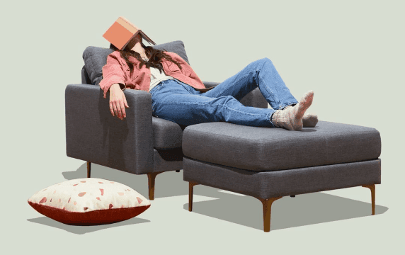
Aimlab VR
I designed core menus and in-game UI for Aimlab’s early VR prototype, translating its PC experience into a comfortable, readable, and intuitive 3D environment for players training in VR.

Bread & Butter
I created the visual identity and landing page for Bread & Butter, an AI education platform that helps everyday professionals learn how to actually use and monetize AI.
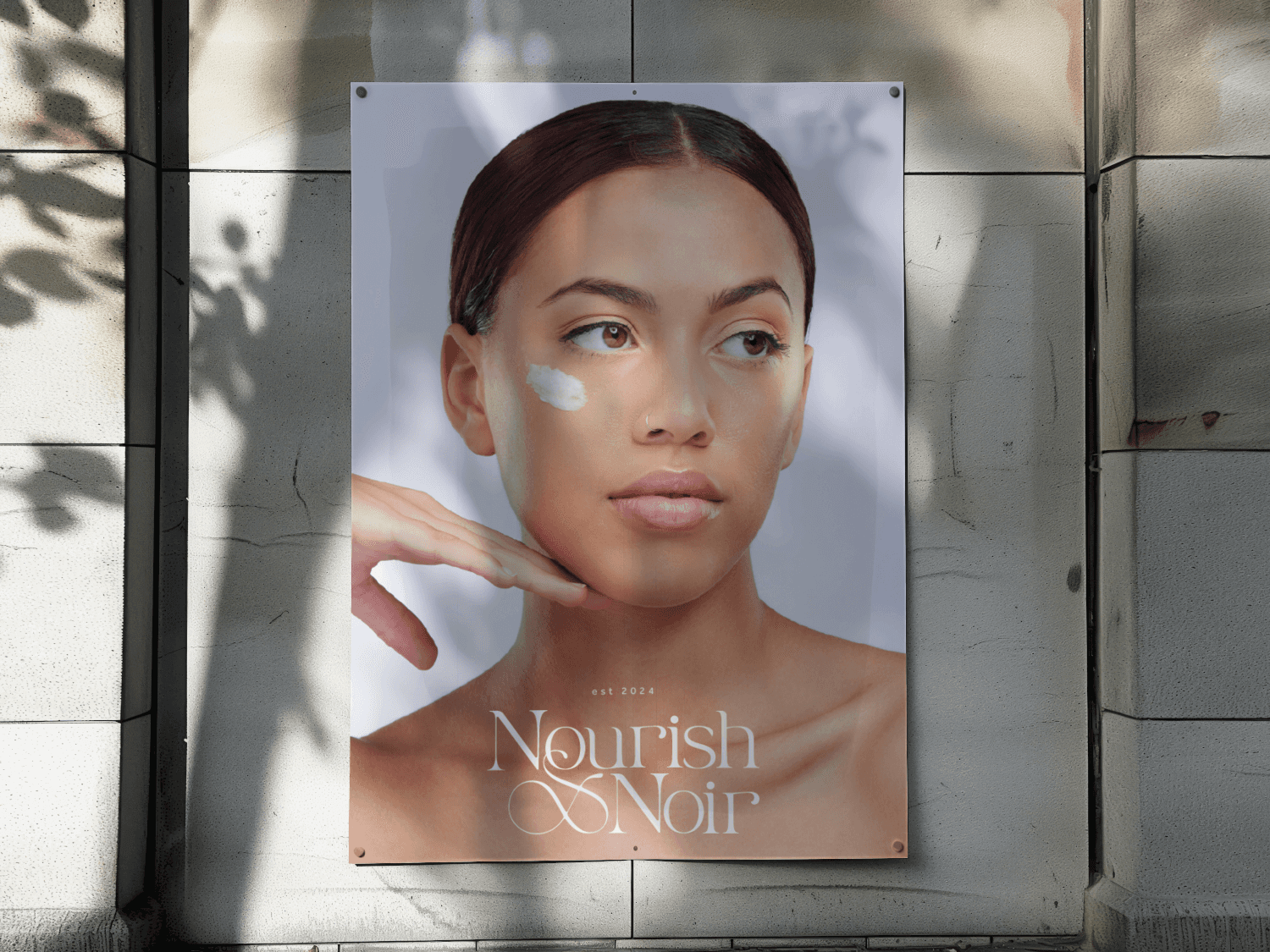
Nourish x Noir
I crafted the visual identity, packaging, and launch visuals for Nourish x Noir, a holistic, black-owned skincare brand and studio.


More Projects
A curated collection of my visual design projects.
Enhanced Navigation for B2B Ecommerce Platform
Through strategic UX/UI improvements, I introduced a more intuitive onboarding flow, advanced search functionalities, and a scalable design system, leading to a measurable increase in user satisfaction and conversions.
40%
Increased Product Discoverability
30%
Reduced Drop Off Rate
UX Solution for Increasing Player Engagment
Design a communication system, allowing players to share achievements and engage with their community without leaving the platform.
60%
User engagment
34%
Increase in user retention
Aimlab VR
I designed core menus and in-game UI for Aimlab’s early VR prototype, translating its PC experience into a comfortable, readable, and intuitive 3D environment for players training in VR.
View Case Study
Bread & Butter
I created the visual identity and landing page for Bread & Butter, an AI education platform that helps everyday professionals learn how to actually use and monetize AI.
View Case Study
Nourish x Noir
I crafted the visual identity, packaging, and launch visuals for Nourish x Noir, a holistic, black-owned skincare brand and studio.
View Case Study