Designing Aimlab VR:
Navigating Ambiguity and Crafting Immersive Experiences in Unity

Stepping Into VR With No Playbook
Early in my career, I was asked to redesign Aimlab for virtual reality using Unity—at a time when I had zero VR experience and no established blueprint to follow. The brief was basically: “Make this feel like Aimlab, but fully immersive.” There wasn’t a clear roadmap, so my first job was to define what “good” looked like in this new medium.
Framing the Problem Like a Product Owner
I treated the work less like a UI practice and more like a product definition exercise. I dug into VR principles—comfort, depth, readable distances, motion sickness triggers—and mapped those constraints onto Aimlab’s core loop: select a task, train, review performance, repeat. From that, I framed key product questions: What does a “quick training session” feel like in VR? How do we keep players focused on performance, not just novelty? Where can spatial UI actually improve clarity instead of just decorating the environment?
Designing, Testing, and Iterating in VR
With that framing, I explored multiple interaction models: floating 2D panels, curved HUDs, and spatial layouts where menus and feedback wrapped around the player. I ran lightweight usability tests—having people stand in mocked-up environments and talk through what felt intuitive versus overwhelming. Each round of feedback drove specific changes: reducing peripheral noise, simplifying hand/controller actions, and clarifying where players should focus at any moment.
I worked closely with developers in Unity, adjusting designs when something that looked great in Figma felt wrong at VR scale or caused discomfort in the headset. I wasn’t just handing off screens—I owned the loop from concept through implementation, making tradeoffs in real time with the team.


Mixed Feedback, Clear Direction
The first release got mixed feedback: many players loved the immersion and “wow” factor, while others surfaced issues around onboarding, clarity, and long-session comfort. I treated that not as failure, but as direction. The response highlighted exactly where the experience was delivering (immersion, interactivity, fun) and where it needed another iteration.
This project didn’t just teach me VR design—it taught me how to navigate ambiguity and own a product in a new space. I learned how to define success when the medium is unfamiliar, turn vague goals into concrete experiences, and use player feedback as a core design input. It reinforced a habit I still use today: ship, learn, and refine until the product aligns with how people actually want to play and improve.
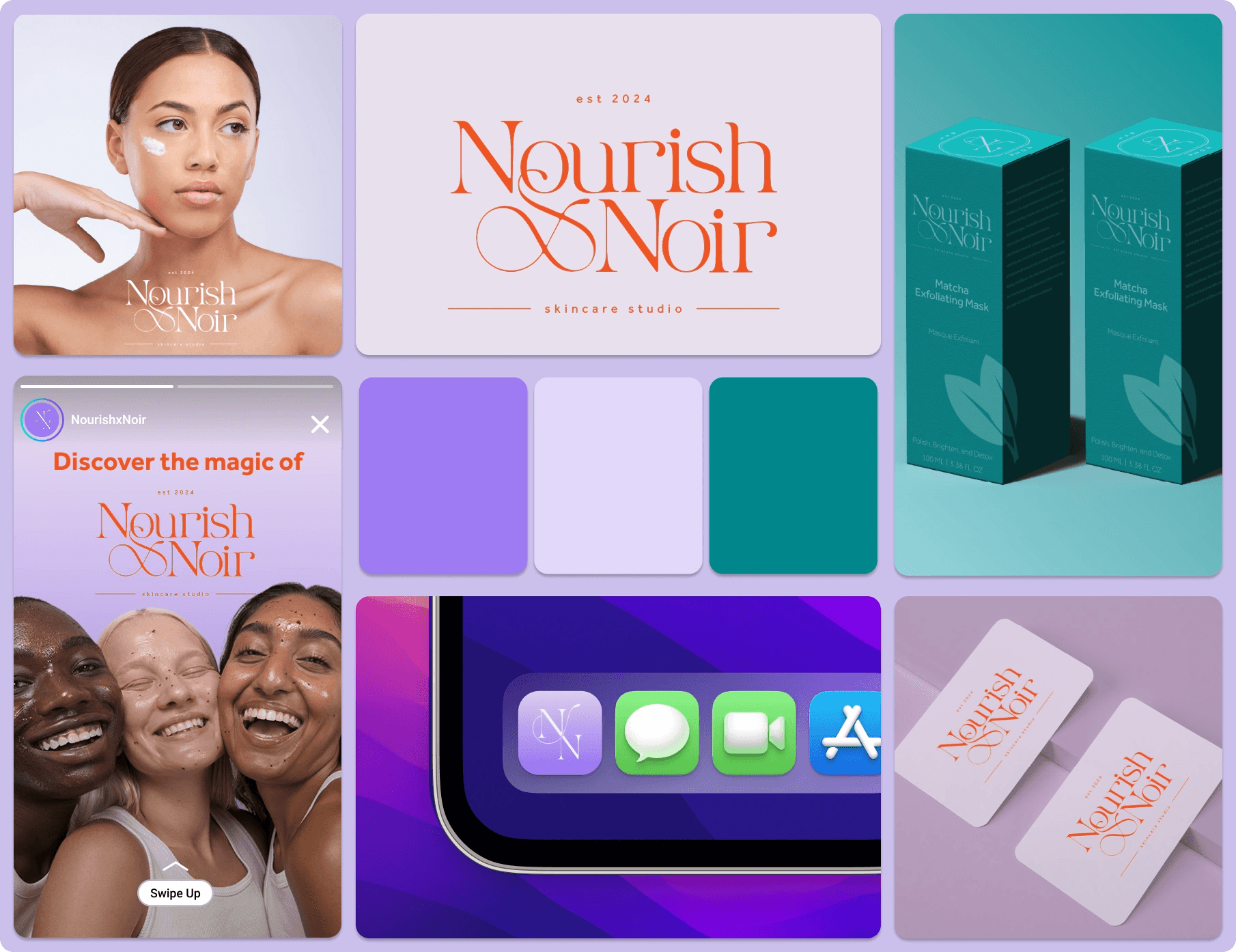
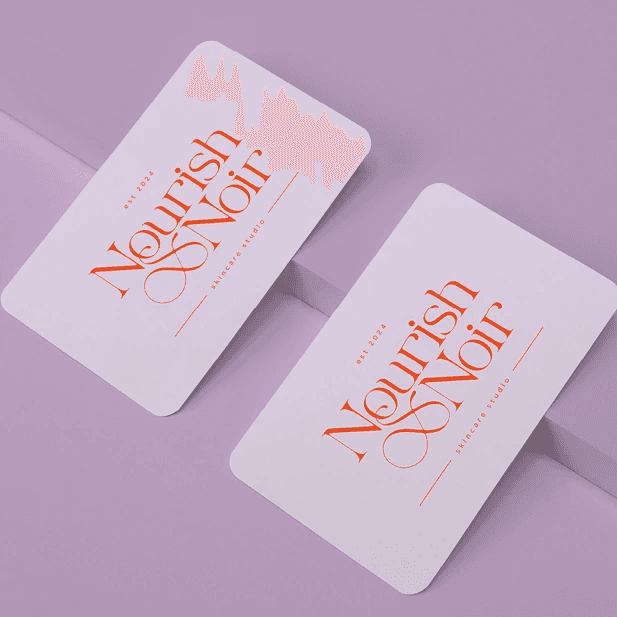
Nourish x Noir
Elevated Brand & Packaging for Skincare Studio
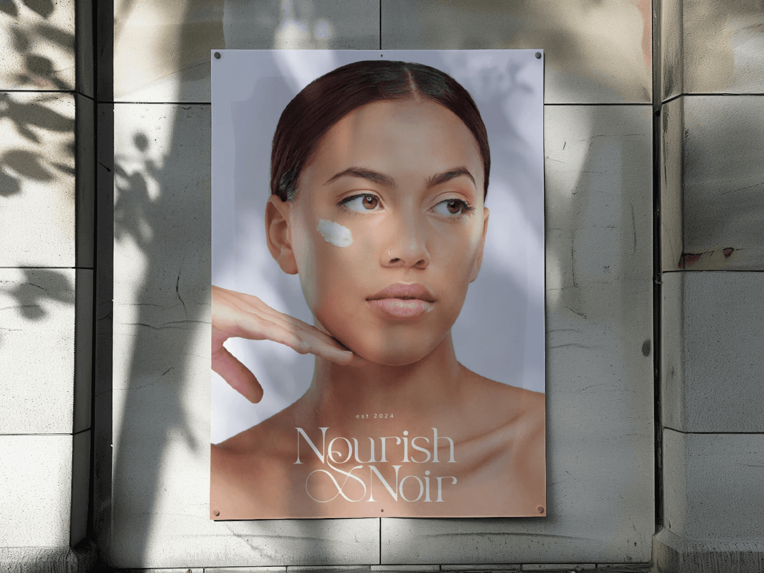
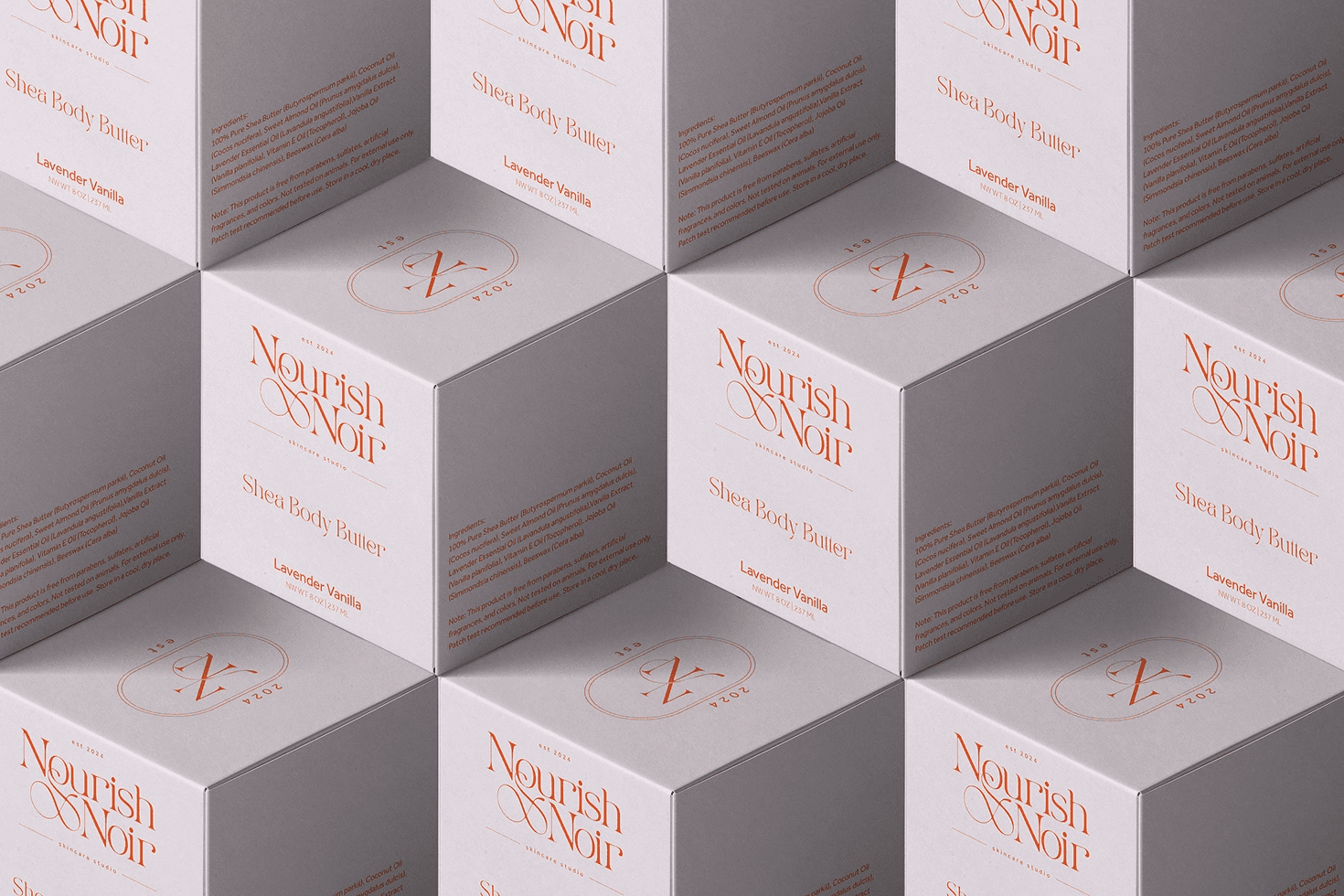
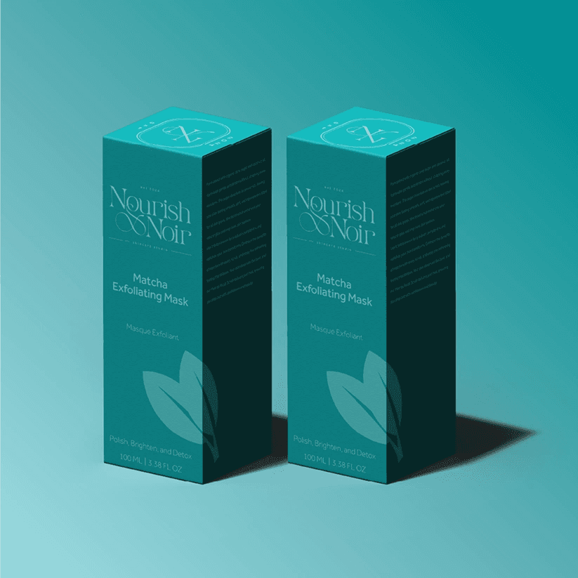
Nourish x Noir is a Black-owned skincare studio created to celebrate and care for melanin-rich skin. The founder needed more than a nice logo—they needed a visual identity and packaging system that could sit comfortably on a shelf next to established brands, feel premium and modern, and still carry the intimacy and community focus of a studio brand. I designed a cohesive identity, packaging, and digital presence that positions Nourish x Noir as a luxe, melanin-first skincare line that looks just as strong on social as it does in real life.
The Challenge
The biggest challenge was balancing “studio-level luxury” with honest, accessible skincare for Black and brown clients. Nourish x Noir couldn’t lean on generic clean-beauty aesthetics; it had to feel rooted in Black beauty culture while appealing to a wide range of skincare lovers. The brand needed a logo and visual system that felt high-end but approachable, packaging that could scale across product lines, and social/digital touchpoints that would instantly communicate: Black-owned, modern, and professional—not DIY or hobbyist.
Audience Insight
Nourish x Noir’s audience cares about ritual, results, and representation. They want products that feel intentional and nurturing, but they’re also very design-literate; they see countless beauty brands on Instagram and TikTok every day. That meant the visual identity needed to signal quality and care at a glance, while also clearly communicating what each product does and who it is for. The brand couldn’t just “look pretty”—it needed to create the feeling of being seen, centered, and welcomed, especially for melanin-rich skin that is often an afterthought in mainstream skincare.
Brand & Visual Direction
I approached the project as a full brand launch. The logo system centers on an elegant wordmark and monogram that feel editorial and timeless—something that could live on jars, boxes, signage, and digital avatars without losing impact. The color palette combines soft lilacs, rich teals, and a punchy coral to balance calm, self-care vibes with a bold, expressive personality. Typography pairs a refined serif for headlines with a clean sans-serif for body copy and UI, giving the brand a flexible voice that can be both intimate and authoritative.
Packaging & Touchpoints
From there, I translated the identity into a packaging system for core products like body butters and masks. Layouts highlight ingredients, product benefits, and ritual steps in a way that feels spacious and premium rather than cluttered. I designed a modular grid so new scents and formulas can be introduced without redesigning everything from scratch. To support launch and marketing, I created social and campaign mockups including hero imagery, Instagram story frames, and a street-poster treatment that positions Nourish x Noir as a real presence in the city—not just a digital-only brand. I also developed an app icon and digital tiles to future-proof the brand for a potential booking or studio app.
Outcome & Reflection
The final system gives Nourish x Noir a clear, recognizable identity that stands out in a crowded skincare market and can be handed directly to manufacturers and collaborators with confidence. The packaging and visual language celebrate Black beauty explicitly while still feeling open and aspirational to a broader audience of skincare lovers. For the founder, the brand now behaves like a studio: consistent across touchpoints, flexible enough to grow, and strong enough to support future services or product lines. For me, this project was a study in designing for both aesthetics and affirmation—building a beauty brand that doesn’t just look premium, but also reflects and honors the people it was created for.
Playground
Playground
A curated collection of my visual design projects
Aimlab VR
I designed core menus and in-game UI for Aimlab’s early VR prototype, translating its PC experience into a comfortable, readable, and intuitive 3D environment for players training in VR.

Bread & Butter
I created the visual identity and landing page for Bread & Butter, an AI education platform that helps everyday professionals learn how to actually use and monetize AI.

Nourish x Noir
I crafted the visual identity, packaging, and launch visuals for Nourish x Noir, a holistic, black-owned skincare brand and studio.


More Projects
A curated collection of my visual design projects.
Aimlab VR
I designed core menus and in-game UI for Aimlab’s early VR prototype, translating its PC experience into a comfortable, readable, and intuitive 3D environment for players training in VR.
View Case Study
Bread & Butter
I created the visual identity and landing page for Bread & Butter, an AI education platform that helps everyday professionals learn how to actually use and monetize AI.
View Case Study
Nourish x Noir
I crafted the visual identity, packaging, and launch visuals for Nourish x Noir, a holistic, black-owned skincare brand and studio.
View Case Study
Enhanced Navigation for B2B Ecommerce Platform
Through strategic UX/UI improvements, I introduced a more intuitive onboarding flow, advanced search functionalities, and a scalable design system, leading to a measurable increase in user satisfaction and conversions.
40%
Increased Product Discoverability
30%
Reduced Drop Off Rate
UX Solution for Increasing Player Engagment
Design a communication system, allowing players to share achievements and engage with their community without leaving the platform.
60%
User engagment
34%
Increase in user retention