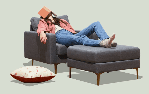
Designing Aimlab VR:
Navigating Ambiguity and Crafting Immersive Experiences in Unity

Stepping Into VR With No Playbook
Early in my career, I was asked to redesign Aimlab for virtual reality using Unity—at a time when I had zero VR experience and no established blueprint to follow. The brief was basically: “Make this feel like Aimlab, but fully immersive.” There wasn’t a clear roadmap, so my first job was to define what “good” looked like in this new medium.
Framing the Problem Like a Product Owner
I treated the work less like a UI practice and more like a product definition exercise. I dug into VR principles—comfort, depth, readable distances, motion sickness triggers—and mapped those constraints onto Aimlab’s core loop: select a task, train, review performance, repeat. From that, I framed key product questions: What does a “quick training session” feel like in VR? How do we keep players focused on performance, not just novelty? Where can spatial UI actually improve clarity instead of just decorating the environment?
Designing, Testing, and Iterating in VR
With that framing, I explored multiple interaction models: floating 2D panels, curved HUDs, and spatial layouts where menus and feedback wrapped around the player. I ran lightweight usability tests—having people stand in mocked-up environments and talk through what felt intuitive versus overwhelming. Each round of feedback drove specific changes: reducing peripheral noise, simplifying hand/controller actions, and clarifying where players should focus at any moment.
I worked closely with developers in Unity, adjusting designs when something that looked great in Figma felt wrong at VR scale or caused discomfort in the headset. I wasn’t just handing off screens—I owned the loop from concept through implementation, making tradeoffs in real time with the team.


Mixed Feedback, Clear Direction
The first release got mixed feedback: many players loved the immersion and “wow” factor, while others surfaced issues around onboarding, clarity, and long-session comfort. I treated that not as failure, but as direction. The response highlighted exactly where the experience was delivering (immersion, interactivity, fun) and where it needed another iteration.
This project didn’t just teach me VR design—it taught me how to navigate ambiguity and own a product in a new space. I learned how to define success when the medium is unfamiliar, turn vague goals into concrete experiences, and use player feedback as a core design input. It reinforced a habit I still use today: ship, learn, and refine until the product aligns with how people actually want to play and improve.
Bread & Butter
Creating an Intuitive Experience through UX Research
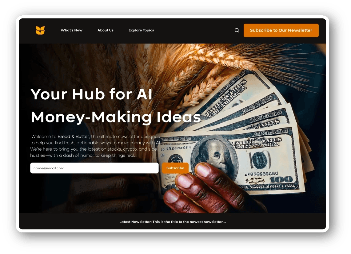
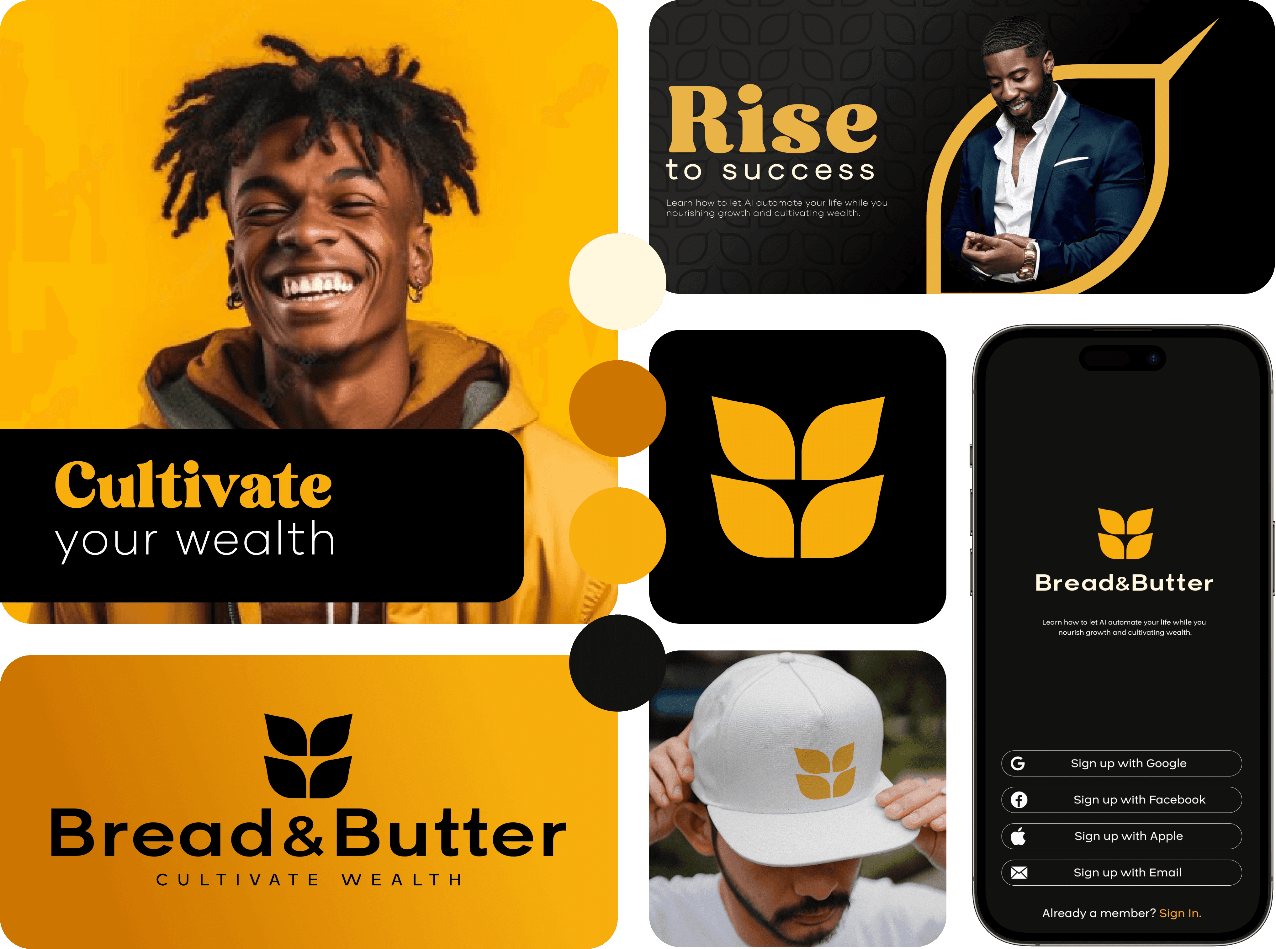
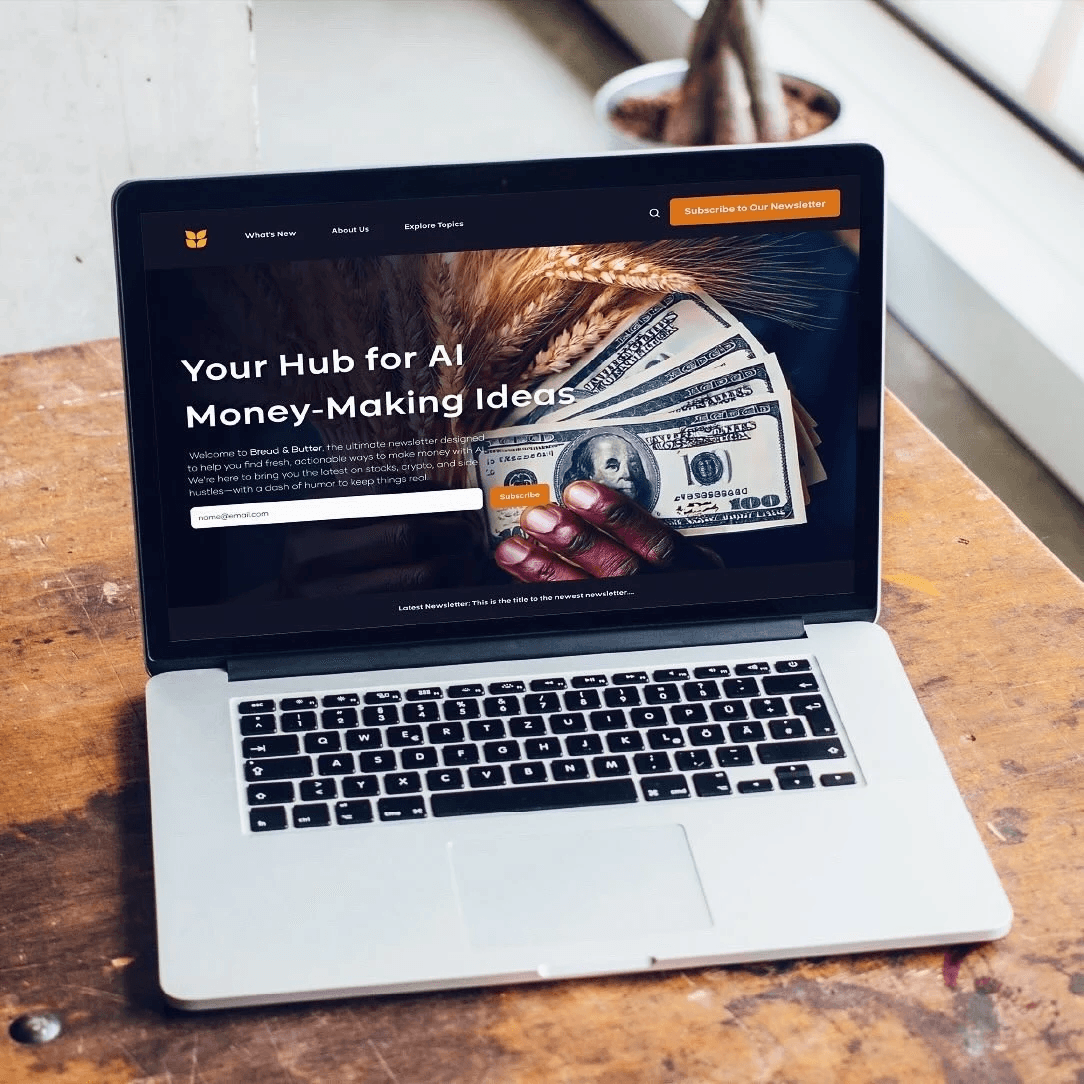
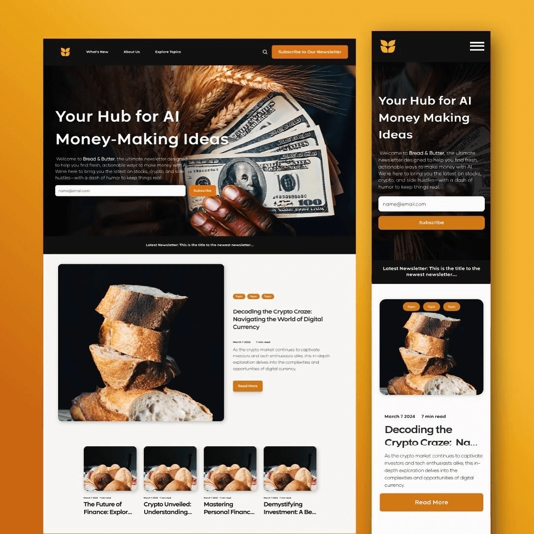
Bread & Butter is an AI education newsletter for everyday professionals who feel behind on AI but don’t want another hype-heavy “future of work” pitch. I created the brand identity and designed a conversion-focused landing page that makes AI feel practical, calm, and usable. My role covered brand identity, messaging, landing page UX/UI, and a small component system in Figma that could grow with the product.
Role & Scope
Product Designer / Brand & Web
Scope: Brand identity, messaging, landing page UX/UI, component system
Tools: Figma, Framer
The Challenge
The main challenge was to speak to non-technical, AI-curious people in a space dominated by jargon and abstract promises. Bread & Butter needed to build trust quickly, explain in simple terms what someone would actually be able to do with AI in their day-to-day work, and capture early interest through waitlist signups while the curriculum and offering were still evolving. The page had to feel safe and clear enough that a skeptical, overwhelmed visitor would stay long enough to understand the value.
Audience Insight
Instead of generic personas, I focused on behavior and mindset. I kept circling back to three groups: curious professionals who’ve tried tools like ChatGPT but feel they’re only using a fraction of what’s possible; career shifters who are worried about staying relevant in an automated world; and creators or freelancers who want to use AI to streamline their workload and potentially unlock new income streams. Across all of them, the same pattern emerged: they wanted plain language, concrete outcomes, and a guided way to start with AI that didn’t make them feel judged, behind, or not technical enough.
UX & Content Approach
Those insights shaped the structure of the page. I wrote the landing as a short, linear story instead of a dense marketing site. The hero message reassures visitors that this is “AI you can actually use in your job,” followed by a brief section that helps them recognize themselves in the audience. Rather than listing abstract modules, I framed the value around what they will be able to do afterward—writing better emails, organizing ideas, summarizing long documents, shaping client proposals. A simple “how it works” section explains the format without overwhelming them with details, and the page closes with a single, low-friction call to action: join the waitlist or get early access. The entire layout is mobile-friendly and intentionally short so someone who already feels overloaded by AI talk can scan the page quickly and still understand what Bread & Butter offers.
Visual Design System
The logo is inspired by a laurel of wheat. Wheat symbolizes abundance, sustenance, and financial security, and reflects the connection between humans, resources, and long-term stability.
The deep black in the color palette introduces a sense of financial comfort, tradition, and groundedness. In contrast, the warm, vibrant tones represent energy, optimism, and an entrepreneurial spirit. Together, these elements position Bread & Butter as a timeless brand that supports financial security, structure, and education while still feeling human, approachable, and a little bit playful—inviting people into a space that often feels exclusive or intimidating.
Outcome & Reflection
The result is a lean, focused landing page that clearly articulates who Bread & Butter is for, what it helps them do, and how to take the next step, without hype or intimidation. It gives the concept a credible home and a way to validate demand early through signups and interest, while leaving room for the product to evolve. For me, this project was a concentrated exercise in turning complex, intimidating subject matter into something calm and actionable. It reinforced the value of designing not just for clarity and conversion, but for emotional safety—especially in spaces where people already feel like they’re late to the party.
Playground
Playground
A curated collection of my visual design projects
Aimlab VR
I designed core menus and in-game UI for Aimlab’s early VR prototype, translating its PC experience into a comfortable, readable, and intuitive 3D environment for players training in VR.

Bread & Butter
I created the visual identity and landing page for Bread & Butter, an AI education platform that helps everyday professionals learn how to actually use and monetize AI.
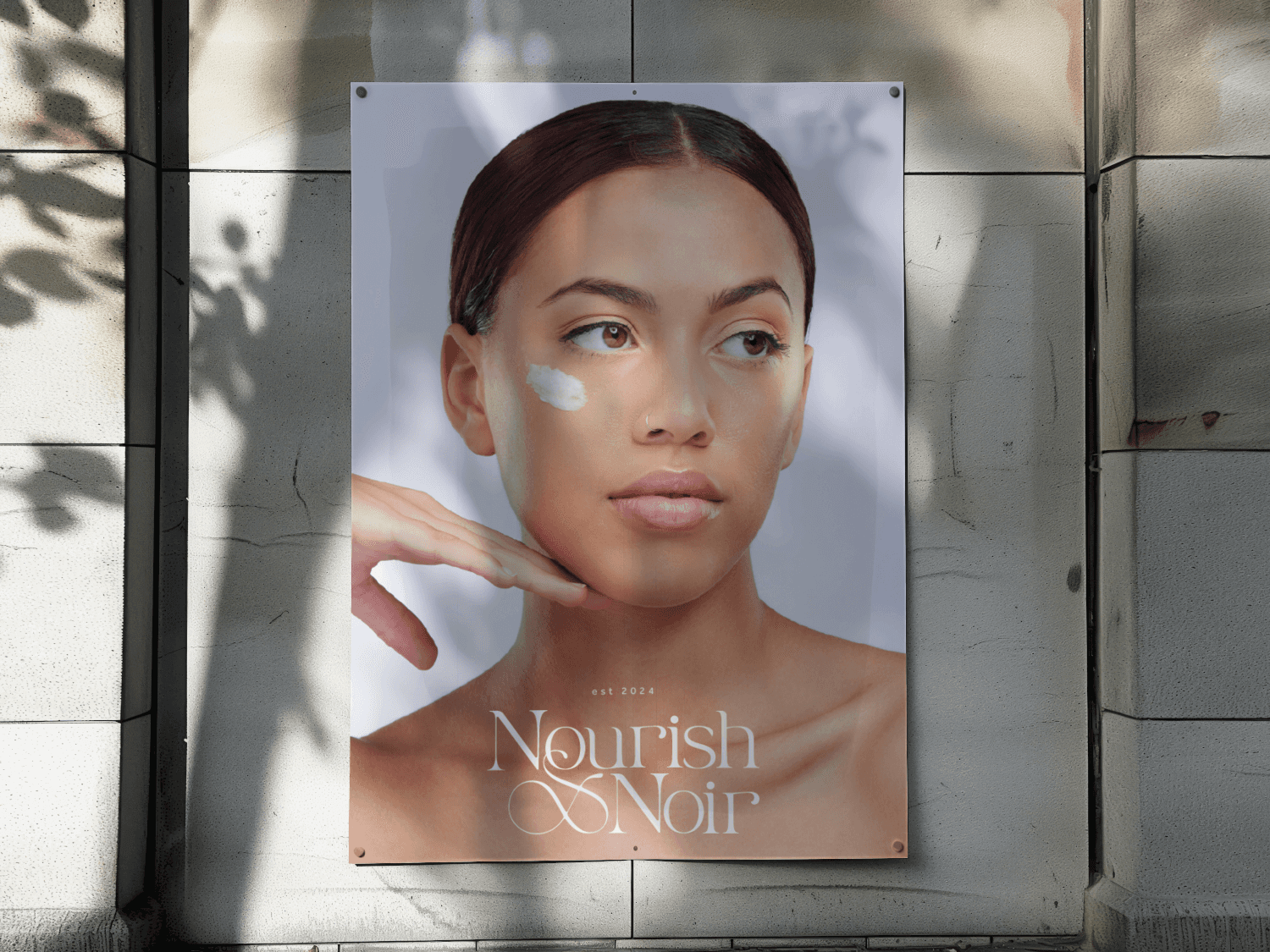
Nourish x Noir
I crafted the visual identity, packaging, and launch visuals for Nourish x Noir, a holistic, black-owned skincare brand and studio.


More Projects
A curated collection of my visual design projects.
Enhanced Navigation for B2B Ecommerce Platform
Through strategic UX/UI improvements, I introduced a more intuitive onboarding flow, advanced search functionalities, and a scalable design system, leading to a measurable increase in user satisfaction and conversions.
40%
Increased Product Discoverability
30%
Reduced Drop Off Rate
UX Solution for Increasing Player Engagment
Design a communication system, allowing players to share achievements and engage with their community without leaving the platform.
60%
User engagment
34%
Increase in user retention
Aimlab VR
I designed core menus and in-game UI for Aimlab’s early VR prototype, translating its PC experience into a comfortable, readable, and intuitive 3D environment for players training in VR.
View Case Study
Bread & Butter
I created the visual identity and landing page for Bread & Butter, an AI education platform that helps everyday professionals learn how to actually use and monetize AI.
View Case Study
Nourish x Noir
I crafted the visual identity, packaging, and launch visuals for Nourish x Noir, a holistic, black-owned skincare brand and studio.
View Case Study